Just as all images, charts and diagrams aren't the most accessible medium out there. But on the other hand, they're a very effective way of visualizing data - far more so than tables or written analyses.
Despite the abundance of various diagrams on the web, we rarely realize that they may present a significant accessibility challenge not only for blind Internet users. Choosing the wrong colors, scale or grid density can significantly reduce a charts readability for all users.
Although a chart will never be fully accessible to a screen reader user, you can still make it more or less accessible for all the other people out there.
Let's start with some data. Here's the latest population distribution according to age for the European Union from the World Factbook:
| Age group | % of population |
| 0-14 | 15.5 |
| 15-24 | 11 |
| 25-54 | 41.9 |
| 55-64 | 12.8 |
| 65 and over | 18.8 |
| Total | 100 |
There are many ways to illustrate this dataset using different types of charts - we'll go through several of them and note their merits and drawbacks.
Basic circle diagrams
A circle diagram would probably be one of the most obvious choices to visualize percentages that add up to 100. If you don't tinker with your spreadsheet's default settings, you'll probably get something like this:
 |
| (A) |
Sometimes you also come across different variations of the same diagram:
 |
| (B) |
 |
| (C) |
The slight differences between them make all the difference when it comes to accessibility - both online and in print.
Diagrams (A) and (C) use a color-coded legend to distinguish between the age categories. This is a very straight-forward solution, but it doesn't work well for color blind or partially sighted users.
A color blind viewer may not distinguish between certain colors. Unfortunately, it doesn't always have to be the well-known red-green pair. There are various forms of color blindness and choosing a set of colors to satisfy them all may prove impossible. You could of course try to use shades of gray to make sure all your colors have different contrast ratios, but this may not be effective when working with a long list of categories.
Using patterns or textures is another option, but looking at such diagrams can quickly lead to eye strain.
Additionally, low vision users may find it difficult to make out the color of a "sample" in the legend due to its relatively small size. Unfortunately, spreadsheets don't always let you change the size of the legend's color samples.
In the case of example (C) a lack of borders between the sections of the diagram additionally contributes to a color blind user's confusion as they may not even be able to work out where specific sectors end.
Diagram (B) partially resolves the color coding problem by placing appropriate labels inside the circle diagram. However, this in turn gives rise to another issue - the contrast ratio between the font and background colors. The font will most likely be black or white which means that if you have both a yellow and red sector in the diagram you're probably not maintaining enough contrast for one of them.
An extra issue with version (B) is the lack of clearly stated distribution values. Looking at the diagram alone it may be difficult to accurately estimate whether a given sector is 20% or 25% and almost impossible to tell apart some smaller values.
Labeled circle diagrams
 |
| (D) |
A labeled circle diagram like the one in figure (D) is by far the most accessible of all the diagrams we've looked at so far. The labels are key here. They help the user easily make out which sector represents which age group and make it easy to associate a category with its value. The only potential issue you may have with this type of diagram is making sure the guidelines connecting a sector with the appropriate label are clearly visible and not confusing - e.g. make sure to have enough space between the lines.
Stack diagrams
Another way to visualize a trait's distribution is by using a stack diagram:
 |
| (E) |
Unfortunately, apart from the value markers on the left axis, this chart does not offer much more accessibility than the basic circle diagrams. If anything it is a little bit easier for color blind users to decipher which color corresponds to which label because the colors in the diagram appear exactly in the same order as in the legend (while circle diagrams with many small sections don't always make it easy to figure this out).
But on the other hand, a wide stack like the one above makes it more difficult to see the difference between categories with similar values.
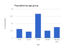
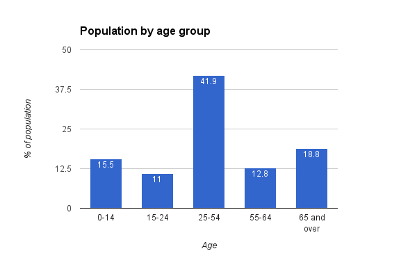
Column diagrams
Another way to visualize data is by using column or bar diagrams. Here are a few examples:
 |
| (F) |
 |
| (G) |
 |
| (H) |
These diagrams all have one major advantage compared to circle and stack diagrams: no color coding. Every column is labeled so it's easy to make out which represents which data category.
The greatest potential accessibility issue in these diagrams is reading column values. Users will usually do this by comparing a column's height to the scale on the vertical axis. So if you care about clarity, you should think twice about the scale you use. Unfortunately, spreadsheets don't always automatically choose the most human-readable scale to illustrate the data. Diagrams (F) and (G) automatically fitted the data into a 0-50% scale but divided the range into quarters producing 0, 12.5, 25, 37.5 and 50 as left axis labels. While technically there's nothing wrong with this, choosing 0, 10, 20, 30, 40, 50 markers would have been much more helpful and intuitive.
Adding extra grid lines as shown in (H) can also be helpful but here too you need to make sure the default settings make sense. Remember that there's no added value in setting secondary grid lines every unit when the main grid appears every 20 units. Too much "noise" behind the data columns will only distract the user.
One more good practice worth remembering is using column value labels like those in diagram (G). This solution is especially worth using when there's little variation between data columns' heights.
And a quick end note on other, non-standard diagrams: though often helpful, they shouldn't be used without good justification. After all, your goal in visualizing data is better and faster comprehension - the user shouldn't spend too much time on figuring out how the diagram works.
No comments:
Post a Comment