Motor disability

Motor impairments are one of the two most important disability categories to focus on when designing products and public spaces (the other one being vision impairments). Simply because motor disabled users - just as blind users - may be completely unable to access poorly designed products or services while other disability groups would probably just have a worse than average user experience.

When asked to give examples of motor disabilities, people usually just mention wheelchair users and go on to assume that the only accessibility they need concerns public facilities such as ramps, elevators and wide-doored bathrooms. They couldn't be more wrong!

Indeed, wheelchair users are probably the most visible fraction, but motor disability isn't all about wheelchairs. The formal definition of motor impairment points to loss of function of a body part - not only total paralysis but also things like decreased stamina or muscle control. This means your motor disabled user group also consists of walking cane users, those with reduced fine motor skills and various types of amputees, All this adds up to a vast and diverse group. A lack of fine motor skills for example may impair precise pointing, wrist twisting or finger bending, maintaining a fixed hand position...

And then there are elderly people who often suffer from several different motor impairments at the same time. This makes using computers, smartphones and high tech household appliances all the more confusing.

The most common issues faced by motor impaired users include operating small or unergonomic hardware elements, reaching distant interface elements, operating touchscreens and performing 2D or spatial gestures.

More details to come in the next post on accessibility for motor disabilities!

Accessible charts and diagrams


Just as all images, charts and diagrams aren't the most accessible medium out there. But on the other hand, they're a very effective way of visualizing data - far more so than tables or written analyses.

Despite the abundance of various diagrams on the web, we rarely realize that they may present a significant accessibility challenge not only for blind Internet users. Choosing the wrong colors, scale or grid density can significantly reduce a charts readability for all users.

Although a chart will never be fully accessible to a screen reader user, you can still make it more or less accessible for all the other people out there.

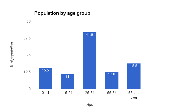
Let's start with some data. Here's the latest population distribution according to age for the European Union from the World Factbook:


Age group% of population
0-1415.5
15-2411
25-5441.9
55-6412.8
65 and over18.8
Total100


There are many ways to illustrate this dataset using different types of charts - we'll go through several of them and note their merits and drawbacks.

Basic circle diagrams


A circle diagram would probably be one of the most obvious choices to visualize percentages that add up to 100. If you don't tinker with your spreadsheet's default settings, you'll probably get something like this:

Basic circle diagram
(A)


Sometimes you also come across different variations of the same diagram:

Circle diagram with category name labels
(B)
Circle diagram without sector borders
(C)

The slight differences between them make all the difference when it comes to accessibility - both online and in print.

Diagrams (A) and (C) use a color-coded legend to distinguish between the age categories. This is a very straight-forward solution, but it doesn't work well for color blind or partially sighted users.

A color blind viewer may not distinguish between certain colors. Unfortunately, it doesn't always have to be the well-known red-green pair. There are various forms of color blindness and choosing a set of colors to satisfy them all may prove impossible. You could of course try to use shades of gray to make sure all your colors have different contrast ratios, but this may not be effective when working with a long list of categories.

Using patterns or textures is another option, but looking at such diagrams can quickly lead to eye strain.

Additionally, low vision users may find it difficult to make out the color of a "sample" in the legend due to its relatively small size. Unfortunately, spreadsheets don't always let you change the size of the legend's color samples.

In the case of example (C) a lack of borders between the sections of the diagram additionally contributes to a color blind user's confusion as they may not even be able to work out where specific sectors end.

Diagram (B) partially resolves the color coding problem by placing appropriate labels inside the circle diagram. However, this in turn gives rise to another issue - the contrast ratio between the font and background colors. The font will most likely be black or white which means that if you have both a yellow and red sector in the diagram you're probably not maintaining enough contrast for one of them.

An extra issue with version (B) is the lack of clearly stated distribution values. Looking at the diagram alone it may be difficult to accurately estimate whether a given sector is 20% or 25% and almost impossible to tell apart some smaller values.

Labeled circle diagrams


Circle diagram with category name and value labels
(D)

A labeled circle diagram like the one in figure (D) is by far the most accessible of all the diagrams we've looked at so far. The labels are key here. They help the user easily make out which sector represents which age group and make it easy to associate a category with its value. The only potential issue you may have with this type of diagram is making sure the guidelines connecting a sector with the appropriate label are clearly visible and not confusing - e.g. make sure to have enough space between the lines.

Stack diagrams


Another way to visualize a trait's distribution is by using a stack diagram:

Stack diagram
(E)

Unfortunately, apart from the value markers on the left axis, this chart does not offer much more accessibility than the basic circle diagrams. If anything it is a little bit easier for color blind users to decipher which color corresponds to which label because the colors in the diagram appear exactly in the same order as in the legend (while circle diagrams with many small sections don't always make it easy to figure this out).

But on the other hand, a wide stack like the one above makes it more difficult to see the difference between categories with similar values.

Column diagrams


Another way to visualize data is by using column or bar diagrams. Here are a few examples:

Basic column diagram
(F)

Column diagram with value labels
(G)

Column diagram with dense grids
(H)

These diagrams all have one major advantage compared to circle and stack diagrams: no color coding. Every column is labeled so it's easy to make out which represents which data category.

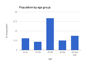
The greatest potential accessibility issue in these diagrams is reading column values. Users will usually do this by comparing a column's height to the scale on the vertical axis. So if you care about clarity, you should think twice about the scale you use. Unfortunately, spreadsheets don't always automatically choose the most human-readable scale to illustrate the data. Diagrams (F) and (G) automatically fitted the data into a 0-50% scale but divided the range into quarters producing 0, 12.5, 25, 37.5 and 50 as left axis labels. While technically there's nothing wrong with this, choosing 0, 10, 20, 30, 40, 50 markers would have been much more helpful and intuitive.

Adding extra grid lines as shown in (H) can also be helpful but here too you need to make sure the default settings make sense. Remember that there's no added value in setting secondary grid lines every unit when the main grid appears every 20 units. Too much "noise" behind the data columns will only distract the user.

One more good practice worth remembering is using column value labels like those in diagram (G). This solution is especially worth using when there's little variation between data columns' heights.

And a quick end note on other, non-standard diagrams: though often helpful, they shouldn't be used without good justification. After all, your goal in visualizing data is better and faster comprehension - the user shouldn't spend too much time on figuring out how the diagram works.

Accessibility awareness survey

Working in accessibility for quite a while now, and seeing how more and more big players in the tech industry reach out and embrace universal design, I started wondering how this massive push for accessibility has effected popular awareness of the issue. So I conducted a little accessibility awareness survey.

Using a web survey portal I prepared a short questionnaire to ask Polish Internet users about their understanding of accessibility. The survey ran for a few weeks in February and here are some of it's findings.

In total there were 320 participants - 61% of which were female and 39% male.

The participants' ages ranged from 13 to 85 years old (my apologies for the huge surplus of 20 to 29 year-old women - I guess they're the group most in to filling out online surveys).


Over 40% of the participants claimed they knew what accessibility was.


Sounds like a great result, right?

But when asked to give a definition, most of the allegedly accessibility aware Internet users don't seem to have much to say. After looking through their answers I found only about 1 in 9 to be anywhere near correct.


According to the most common misconceptions accessibility is either equivalent to website uptime or free software downloads (sic!). Quite a few participants also honestly admitted they're unable to define the term, even though one question back they claimed to know it's meaning.

The results were more optimistic for those working in Internet related branches of industry such as IT, e-commerce and telecommunications. Here, nearly 65% of the participants said they knew about accessibility and around 36% were able to give a fairly correct definition.


After providing the participants with a proper definition of accessibility I asked them to point out groups that could benefit from its implementation.

Over half (56%) of the respondents were unable to point to any group of beneficiaries. Another 11% claimed that accessibility benefits IT professionals such as programmers, designers or bloggers and 16% suggested completely irrelevant answers (e.g. companies, researchers or celebrities), which would suggest that these participants don't exactly grasp what accessibility is despite being given a proper definition.

Just 11% claimed that everybody could benefit from accessibility. And, surprisingly, only 3% of the respondents mentioned the elderly and under 6% pointed to disabled users!


For Internet related industry professionals the results were slightly better. Even though over 50% were unable to point to any group of beneficiaries, yet at least more of them realized that accessibility aids elderly and disabled users. And no one suggested it is something you implement for the benefit of the developer.


Asking about how to make software accessible didn't ring a bell with the general public either. Just under 6% of the participants were able to point to various assistive technologies as the solution. 75% declared they don't know how to enforce accessibility and the remaining 19% proposed irrelevant solutions (e.g. website positioning or online marketing).


Unsurprisingly, when asked about implementing accessibility the Internet industry professionals managed to nail the right answers more often than users from other backgrounds, though with 65% still not being able to produce any answer, you wouldn't exactly call it common knowledge...


Altogether, this little survey shows there's still much to be done before accessibility awareness is common in the IT industry, let alone the general public.

Keep in mind that the figures presented in this post were based on a relatively small group (320 participants) and are probably not representative for the general population.


Accessibility vs UX

Accessibility, usability and user experience are tree terms often perceived as a single step in the whole product development process (and to be performed by a single "general purpose" designer). Which often ends in disappointment when our UX designer approved software turns out to have accessibility issues - and beware, these are often neither easy nor cheap to fix once the product is out on the market.

Formal definitions aside, accessibility means a product is available to everyone regardless of the way they operate their device.

Usability guarantees the product is easy to use, intuitive and easily learnable.

User experience on the other hand tries to make a product attractive and fun - turning it into an experience rather than just another mundane tool.

Definitions of accessibility, usability and UX


I've tried and failed to order these terms into a nice, logical pyramid-like structure to visualize the importance and hierarchy between them. Besides, half of the UX designers out there would have probably disagreed on the hierarchy anyway ;).

For maximizing a product's audience, the most sensible approach would be to first make sure the product is accessible to all, then work on it's usability to support the actual functionality we're trying to sell and finally package the whole thing in a compelling user experience design.

Ironically, even though from my perspective product accessibility is a "must" and great user experience would only count as a "nice-to-have", the most basic design decisions such as who an app is for and what it should actually do are questions of unmet needs which should be answered by a UX researcher before anybody even does a line of coding or design work.

Of course, you can decide to ditch accessibility and make a pretty, shiny and totally inaccessible product which will give your young, lean and always energetic audience thrills along their spines and never mind those aging grannies that you're probably discouraging from ever even looking at your new invention, why not? It's a free market.

But keep in mind that accessibility often turns out to have much in common with ergonomics and will also make it easier for your regular audience to effectively use the product.


Accessibility by Example: Windows log in screen

OK, so you've read the theory on accessibility and are probably wondering what it all boils down to in practice. Well, that's what the "Accessibility by Example" posts are going to be about.

I'll be showing examples of accessible (or inaccessible) websites, software, hardware or just about anything else I can think of.

Let's start with a picture that'll probably seem familiar to most of us:

Windows 7 login screenshot

Microsoft's Windows operating system has been at the top of the pack for OS market share for years. You can pretty much assume that if somebody uses a computer they've probably seen a Windows log in screen at some point or another.

You see it, click on a user tile, type your password, hit enter and off you go.

But have you ever wondered what it's like for someone who can't see? Or maybe just has low vision? Or can't operate a mouse or keyboard all that accurately? Or - improbable as it may sound - sees it for the first time?

Color contrast


If you've read my previous post on basic accessibility for low vision users, you'll have probably already figured out that there's something seriously wrong with the color contrast.

Light blue paired with white make a popular and modern looking but unfortunately also quite inaccessible color theme.

The color contrast for the username text on this login screen is barely around 2.0 (actually it's between 1.9 and 2.5 as the blue is darker on one side and lighter on the other) - while the WCAG minimum is set at 4.5! The shading on the buttons doesn't help much either.

Blue and white can be combined to make a very accessible color theme, but you need to make sure you choose a blue dark enough to give you the desired contrast ratio.

Widget size


Button size (or, in general, clickable UI element size) is a major accessibility factor, important primarily to low vision and motor disabled users, though bigger clickable areas also considerably increase a product's overall usability for able-bodied users as well.

Here, both the login button and the ease of access button (sic!) are small to say the least. Neither of them are an easy target for someone who has trouble precisely operating the mouse. Moreover, a visually impaired user might actually not notice the ease of access button considering its size and the poor color contrast!

The only large, easily clickable widgets on the screen are the avatars that represent different users.

Layout


Apart from the irrationally frugal use of button space the layout is a good one.

Not only does it strongly support the screen's primary use case (i.e. actually logging in to the system), it also places the controls for other relevant use cases in easily accessible places. Even a severely visually impaired user who can normally barely follow a pointer on the screen or motor disabled user having difficulties with precise hand movements, will probably be able to move the mouse to the bottom left corner to open the accessibility menu and turn on supportive features for their disability (assuming they see the button or otherwise know it's there).

Fonts


There's not much text on the login screen which doesn't yet mean there's no room for improvement as far as the font goes. The clear, sans serif font is a pretty good choice (it's been claimed that sans serif fonts are more readable than serifs). But that's not much of a merit when you outline your font with a shadow and put it on top of a barely contrasting background.

Nevertheless, I wouldn't blame the font for this screen's accessibility issues.

Keyboard access


The screen is keyboard accessible which means that both screen reader users and those who can't use a mouse can operate it.

After choosing a user, focus automatically moves to the text field so you can type your password straight ahead. After that all you need to do is hit the enter key to log in.

The keyboard focus animations, however, are barely visible to low vision users.

Comprehensibility


The big user avatars are a good hint that you should first choose a user for the login session.

The text field also clearly signals what is expected of you thanks to the "Password" ("Hasło" in my Polish system version) hint placed inside it.

The arrow button, however, could have been replaced with something more explicit (e.g. a classic "Log in" button) especially as it's so small and easy to miss.

One more non-standard icon used in this screen is the "ease of access" button. True, it may be known to Windows users, but won't necessarily ring a bell with those migrating from other platforms where a simple wheelchair icon is usually used to represent accessibility settings.

Conclusion?


What can I say... I often use this logon screen as a practice accessibility evaluation task for the participants of my accessibility trainings and they're always amazed at how poor this design is accessibility-wise.

Not to say it doesn't have it's merits - it could easily be turned into a fully accessible screen by applying just a few basic accessibility principles like providing adequate color contrast and element size.

Top 10 accessibility fails

Choosing just ten major accessibility fails wasn't an easy task, but here's my personal list of bad accessibility and usability practices.

Inadequate color contrast


To many, color contrast is more of a question of aesthetics than usability. Quite the contrary! The color theme you choose for your product can severely influence its accessibility.

Adequate color contrast doesn't mean you need to resort to boring black and white. There are lots of color combinations with a reasonably high contrast rate. But be aware that the extremely popular white & light blue color theme is not one of them.

Poor information architecture


Information architecture is one of those things you never appreciate until it's broken. And you can be sure that once you break it, lots of people will notice and feel entitled to share their discovery with others.

The truth is: your user should never have to think too much while using your product. Finding things should always be obvious and intuitive.

A pretty graphics theme won't help a messy information model. You want your menus to be logically structured and appropriate to the use cases you expect your audience to engage in. You want your links to point to the things the user needs in a given context. And most of all, you want to minimize information clutter and make sure everything your user sees is there for a purpose.

Small action items


Tiny paddingless buttons tightly huddled together, checkboxes you have to explicitly click within that little white square to select, three-letter inline link texts... one thing they all have in common is how inviting they are to error.
  
Reading small text is one thing but misclicks or not being able to perform an action altogether are a totally different story!

Providing large clickable items and enough space between them is crucial to low-vision and motor disability accessibility. It also helps elderly people and all those who lack fine motor skills.

Partial or no keyboard access


Most people never even think of using a computer without a mouse. But believe it or not, quite a few people actually do use the keyboard for more than just typing text. Blind, low-vision and motor disabled users may all resort to keyboard access in order to compensate their disability and move around faster.

Nowadays, keyboard access is quite simple to provide - all you really need to do is adhere to good programming principles like setting up headings or adding basic keyboard shortcuts etc.

Text as images


The only good cases for using images of text are logos and artwork. In all other cases text should be entered as text (e.g. as a label) and preferably also be selectable and copyable.

If for some reason you really, really need your text to be an image - be sure to add an alternative text to it.

Overcomplicated language


Why is the polite "Please enter your e-mail address" inferior to a crude "Enter e-mail" command? Well, being polite is great but when it comes to user interfaces you want your labels and descriptions to be as short, clear an concise as possible. Why?

For one thing: you don't wan't your user to waste time on reading more than is absolutely necessary to perform the task they're aiming to finish.

Secondly, your audience may also contain intellectually disabled users who find it difficult to understand or concentrate on complex expressions.

And last but not least - remember that a low vision user may enlarge the text of your website or application which often results in the software's labels not fitting in their corresponding text areas.

Handling input errors


Input errors don't just happen do disabled people. But when they do, it can take quite a while to figure out what exactly has gone wrong and how to correct the erroneous input.

An input error message should always let the user know which field triggered the exception and provide instructions for supplying a valid input (e.g. the desired date format, password size requirements).

Incorrect text alternatives


Text alternatives are descriptions of non-text elements to be displayed to people using text-only viewing interfaces like screen readers or text browsers. Their sole purpose is to provide useful information. Why then add a "pretty smiling lady" alt text to an add or "green floral decoration" to a banner?

Actually, there's a good practice solution for just such a case. All uninformative or purely decorative content should be given an empty string as their alt text. All other content should be tagged with a concise description.

Hover menus


Hover menus are not inherently evil but they do tend to be a real pain in the ass for many elderly, motor disabled or low-vision users. E.g. a hover many may work fine at the standard browser magnification level, but could go all over the place once you set magnification do 300%. Moreover, they're unbelievably irritating if you're not too good at moving the mouse precisely: the menu will hide and reappear each time you accidentally swipe too far.

Hover menus were meant to save space. But at the same time they're barely usable when their items start sprouting submenus. And besides, having this enormous menu you can't fit on your webpage... are you absolutely sure you've got your information architecture right?

Blinking content


There's a good change you've heard about photosensitive epilepsy and know that blinking light's may trigger an epileptic seizure. But on the other hand, flashing, moving or blinking content is so widespread on the web it seems a must-have.

The truth is there aren't all that many photosensitive epileptics. And even among them, not every one will automatically have a seizure from looking at an animation. But flashing content may also cause discomfort or eye strain to many able-bodied users so it's good practice suggests you minimize flashing and blinking whenever possible.

Basic desktop accessibility features for low vision users

Having discussed the basics of web accessibility in a previous post, it's time to take a look at the accessibility features desktops have to offer.

Magnifiers


A screen magnifier is a piece of software used to, well, magnify all or part of the visible screen. Simple as the concept may be, it is often quite confusing for those not used to it.

A screen magnifier may take the form of a virtual lens you move around the screen using your mouse. But it may just as well be docked in a corner or at one edge of the screen giving the user a special "magnification zone" showing whatever the mouse is currently pointing at. Or you could have a full screen magnifier which magnifies the whole screen at once.

Naturally, the magnification level can be customized - sometimes you can set any value you like, but usually you have to choose amongst a few predefined options.
 
A magnifier can also provide additional features such as color options for the magnification window or focus and keyboard tracking.

There are various screen magnifiers available for different platforms, e.g. the Windows Magnifier application or Compiz for Linux.

Color themes


Color theme customization is the next most important accessibility feature for low-vision users.

Unfortunately there is no such thing as an optimal color theme for all users - or even all use cases.

It is typically assumed that high color contrast (such as putting white text on a black background or vice versa) is a good thing. This, however, does not necessarily need to be the case for all users.

When dealing with large bodies of text, many people will intentionally avoid high contrast, claiming it tiers their eyes.

Similarly, choosing between the dark foreground on light background or dark background with light foreground models is also tricky and depends solely on users' individual preferences.

Pointer settings


When using a pointing device (most commonly a mouse - even when you're considering a group of disabled users), most people probably won't ever think of configuring it. However, customizing pointer size, speed or sensitivity is a great option for disabled users (both low-vision and those with motor disabilities).

Also, enabling pointer trails (i.e. animated trails or shadows left by the mouse to indicate it's former position) are another useful option to help the user keep track of the mouse.

Keyboard shortcuts


Last but not least: keyboard shortcuts. They're probably the most underrated accessibility features ever.

Low-vision users are usually more comfortable using a keyboard than a mouse. This is because using the mouse requires you to constantly track the pointer's position on screen while a keyboard layout can be easily memorized and then used regardless of your visual capabilities.

A low-vision user will naturally drift towards keyboard shortcuts because they don't force him or her to constantly look for things on screen (the mouse pointer, a specific button etc.).

Basic web accessibility for low vision users


The range of visual impairment goes from "needs reading glasses for fine print" all the way to "blind from birth". Maintaining reasonable usability for this vast user group may seem a treacherous task (and to some extent it is indeed), but in this post I'll just focus on the sheer basics everyone needs to know.

Small text


The most obvious usability observation is that low vision users can't read small text. Duh! Depending on the degree of vision loss the user might be able to read the text by putting on glasses or moving closer to the screen or might not see it at all no matter how close up they get. When all else fails, a low vision user will do it the hard way and put a hand-held magnifier up to the screen to read the text - but believe me, you don't want to force make them do that! It works but it's uncomfortable, it's embarrassing and feels degrading. And totally not what you want to do when you're not alone in the room.

Unfortunately, big bulky fonts aren't widely acknowledged for their beauty or usability and clients somehow don't approve of larger font sizes, so designers tend to make default fonts pretty small. This in turn makes the site less accessible to low vision users.

Some web designers try to solve this problem by adding an enlarge text widget at the top of their page (or just beneath the heading of an article) to increase accessibility. It usually looks something like this:

AAA enlarge text button


You'd think that just about does the trick, but that's not the case. Of course, it's a nice little gesture of sympathy for some elderly or novice low vision users but many visually impaired don't ever click that button. Why? Here are a few potential reasons:
  • they don't notice it (seriously, it's happened to me),
  • they don't bother because they're used to hitting Ctrl + "+" (the typical browser shortcut for increasing the zoom level) or using some other system wide accessibility shortcut instead,
  • the maximum text size available through the widget is still too small.
The people who do use the triple "A" widget will probably be those with minor vision impairments. The really low vision users will have already found out about browser or operating system accessibility features.

Does this mean that the "enlarge text" button is a worthless addition to your web page? Not necessarily. There are people who will use it. But considering current web browsers' capabilities this feature definitely shouldn't be your top priority.

Fonts


Much more than font size, font face is something you should focus on - especially since it influences usability and user experience for all your users, not only the low vision ones.

If you value your website's usability, use a simple font. Fancy or handwriting style fonts are gorgeous to look at and at the same time a total readability disaster. They're not-so-easy to read for fully sighted users, let alone the visually impaired.

A simple font also makes a site more accessible to users with cognitive, learning or attention span disabilities.

Page layout


Now, here's something that should get your full attention.

Try this simple experiment: open up a couple of websites and view them at a browser zoom level of about 300%. Yes, 300%, it's not a typo.

What do you see?

Notice, that when you magnify a web page too much ("too much" basically meaning "more than the developer found plausible") you suddenly have to cope with lots of horizontal scrolling (and sometimes the page layout goes berserk or parts of the page disappear beyond the edge of the screen never to be seen again, but lets not worry about that for now).

Too much horizontal scrolling is a big usability "no-no" - it's time-consuming and amazingly irritating when you have to scroll back and forth to read every single line of text on the page. It's definitely something you don't want to force on your low vision user. Narrower columns of text definitely make life easier for those using magnification.

There isn't really a standard for optimal line length. If you set your browser zoom to 1000% (assuming the browser allows it) you'd have to put in a word a line and pray for no long words to appear. But that's not the point. Keeping your page looking reasonably usable at a magnification level of 200% or so is a good start.

Color schemes and color contrast


The last key accessibility component of a website is its color and graphics scheme.

One common misconception is that accessible websites are ugly. Yes, they can be ugly. But guess what, inaccessible websites can be ugly too.

For basic accessibility pretty much all you need to do is provide good contrast for the text on your page to make it easily readable.

I'll write a separate post on color contrast at some point, but for now assume that two colors provide good contrast if they are easily distinguishable when viewed in black and white. To get an idea of what "easily distinguishable" means: blue and yellow or white and blue are good but red and green or white and light gray are not.

color contrast examples

To make sure you've got a good contrast ratio, put the codes of your chosen text and background colors into a color contrast checker. You should aim for a contrast score of at least 4.5.

Also remember not to overdue it when it comes to patterned surfaces as they are another readability decreasing factor. If possible keep the text's background solid.

Summary


In short, the most basic rules for making a website low vision user friendly are:
  • Plan the layout of your page with magnification in mind.
  • Keep a good contrast ratio between the text and background.
  • Use simple, easy-to-read fonts.
  • Be careful when it comes to using patterns and textures.
  • Keep the default font a reasonable size - a text enlargement button is a nice addition, but users have many other ways to magnify the text.
More to come soon :)

Setting accessibility priorities

Although disability comes in all shapes and sizes, when it comes to using technology, some impairments are more hindering than others. Consider a partially deaf user and one with severe visual impairment. When given a device with no accessibility features whatsoever, the deaf user will probably be able to use it out of the box while the visually impaired one may get stuck as early as the device's login screen unable to enter the password or PIN code. Similarly, a paralyzed user may not even be capable of holding the device or entering text using its keyboard. On the other hand, an epileptic or someone suffering from ADHD won't experience the same difficulties at such a basic level of device operation.

That's why, when it comes to usability and accessibility, some users' needs are more of a priority than others'.

Typically, the first thing that comes to mind when you think about accessibility features (or at least the first thing I hear from the attendees of my accessibility trainings) is large fonts. Some also mention magnifiers and screen readers (not necessarily actually calling them "screen readers" - rather "talking computers" or something of the sort :) ).

And indeed, designing accessibility features to boost software and hardware usability for visually impaired users is on the top of every manufacturer's priority list (assuming they are already at the point of caring about accessibility in the first place). Why?

Often, the answer goes something like "because everybody else has it", which isn't a very good answer, but does illustrate the point that accessibility for blind and low-vision users must be important since it's so widespread.

Actually, the reason it's so important is because visually impaired users (especially blind and very low vision users) could be completely cut off from your product or content unless you provide some accessibility enhancements. Other special needs groups will probably be able to use an inaccessible product to some extent - though they will probably experience lowered usability and user experience compared to non-disabled users.

A similar problem arises for those suffering from various motor impairments - especially when it comes to small physical devices like smartphones or smartwatches.

That's why accessibility usually starts with magnifiers and big button interfaces. Which isn't to say that other disability groups don't deserve their own accessibility features!

Disability statistics


Since you already know that the prevalence of disability is around 15% worldwide, you're probably wondering what the proportions of various disability types are and which age groups they tend to effect, so you can focus on the most needed accessibility features first, right?

Sounds like a great idea, but there's just one problem: disability statistics are a mess.

Every now and them my job obliges me to look up all the latest disability figures for some presentation or another to convince a stakeholder that there actually is a user base for accessibility features and products. And I must admit I am equally frustrated by the venture every single time.

Sadly, there's no one good source of disability statistics. Different institutions usually only collect this kind of data once every few years. Various reports use different definitions of disability which make the data hard to compare. Some researchers only looks at formal disability (the criteria for which may differ significantly between countries), some use their own disability indicators (e.g. being able to walk a given distance or see newspaper print without a vision aid), others ask respondents for their subjective disability assessment. There's no consistency in dividing the disabled population into age groups, etc...

Despite all this, here are a few sources you should definitely consider on your quest for disability data:
Starting at the WHO estimate of 15% disabled people worldwide you can further inspect their Fact Sheet on Disability to find out that between 110 and 190 million adults experience significant difficulties in everyday functioning. These 110 to 190 million would be your prime accessibility target - people who probably won't be able to access your technology without some sort of assistance.

For the US population the disability rate in 2010 (the time of the last Americans with Disabilities report) was at around 19% and over 12% of Americans were severely disabled. Severe disability could mean being blind or using a wheelchair opposed to non-severe disabilities like "having difficulty seeing regular print" or "having difficulty climbing stairs".

As you may expect, disability is more common among the elderly. While there are only about 10% disabled Americans under 45, the figure skyrockets in older age groups going from just below 20% for 45-54 year-olds to a staggering 70% for over 80s.

Moreover, for the over 45 age groups the prevalence of severe disability steadily rises from around 13% for 45-54 year-olds to more than 55% for the over 80s.

Prevalence of disability by age

Source: Americans with Disabilities 2010

The same report also provides some data on disability types.

Here the disability prevalence for various disability types is calculated for two age groups - all those over 15 and the elderly, i.e. people over 65 years of age.


 By far the most common problem areas are motor function related: walking, standing and pulling (each approximately 10% and 30% for the respective age groups), lifting (7% and 21%), reaching (5% and 15%). Seeing and hearing disabilities were reported by a liitle above 3% over 15-year-olds and 10-11% over 65s. Also, notice, that something we take for granted like grasping is difficult or impossible to do for around 7.5% of elderly users!


Prevalence of various disability types by age

Source: Americans with Disabilities 2010

Another survey, the US Census Bureau's American Community Survey distinguishes six basic disability types: hearing, vision, cognitive, ambulatory (motor disability), self-care and independent living. The "Americans with Disabilities" report also contained data for various everyday life activities (referred to as ADLs, i.e. activities of daily living) such as dressing, bathing or eating without assistance but did not address them jointly as a specific disability type. Although the self-care and independent living categories don't really convince me (they'll most commonly be a result of the respondent having various different disabilities at the same time which - combined - make him or her unable to live independently), they do provide some insights into disability prevalence.

According to the 2013 Survey's 1-year estimates, motor disabilities are once again the most common impairments in adult age groups, but in this report they effect just 5.2% of 18 to 64 year-olds and 23.3% of over 65s. The second most popular disability depends on the age group and is cognitive disability for the working age population and hearing and independent living disabilities for older adults. Poor vision is at the bottom of the list with 1.2% for younger adults and 6.8% among the elderly - way below the estimates given by the "Americans with Disabilities" report.


Prevalence of disability types by age
Source: 2013 American Community Survey 1-Year Estimates

Hopefully, as time goes by, disability statistics will get better and more consistent. Oh, and just for the record, accessibility usage stats are even harder to come by. Pretty much the only thing we can say for certain is that the number of disabled people is steadily rising (mainly due to population ageing) and so is elderly users' technology awareness (after all, the grandads and grannies of tomorrow are going to be people who are already accustomed to using PCs, mobile phones and tablets) so the demand for accessibility aware design can only increase.